


By Joe Bursley Adventure Time. Gravity Falls. Steven Universe. Star vs. The Forces of Evil. It’s not hard to argue that this past decade has seen many great cartoons with well-developed characters, beautiful music, and deep stories begin to overtake the episodic wasteland wrought by Spongebob Squarepants and others. But that is not all these shows have in common, according to some. These and other modern cartoons all suffer, supposedly, from a disease called CalArts’Style by many who critique/complain on the Internet. But what exactly do these critics mean by the term "CalArts" Style? Also called “Thin-line animation,” the term “CalArts” style is used to, more often than not, criticize the simpler character designs of many shows over the last 8 years or so. Many fans of Western animation have griped about the “simplistic” design of these cartoons, which all seem to feature round eyes, noodle arms, “bean-shaped” heads and “worm-shaped” mouths. And, as much as I hate to give credence to anyone who complains on the internet, I must say: they do have a valid point.
 Image from The Roundtable YouTube
Why do they look like that?
thick-line animation Image from TVTropes
Is this lazy and simplistic?
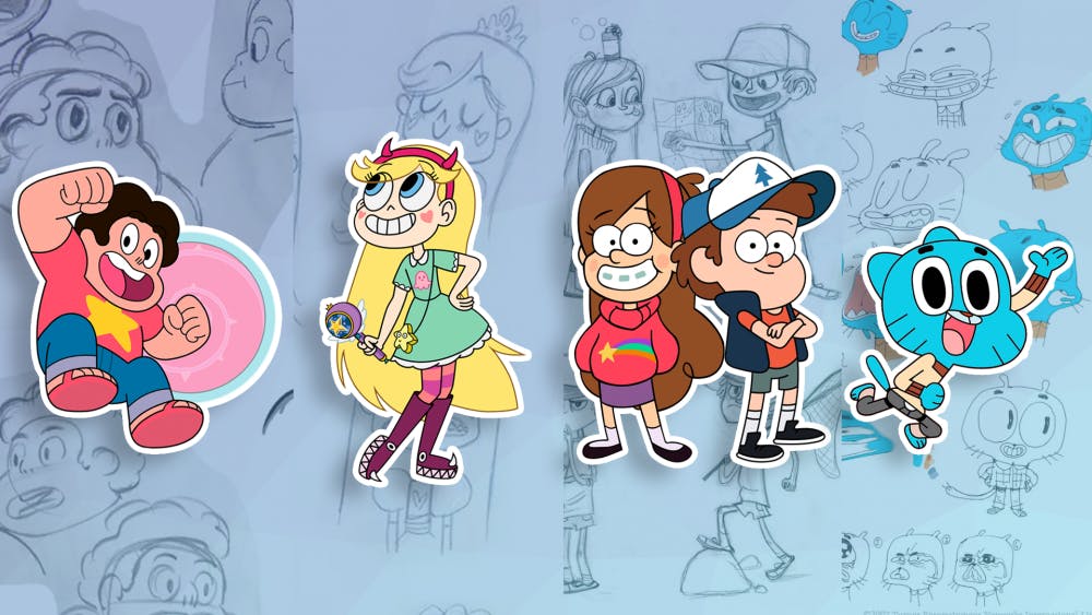
Steven Universe background art The Amazing World of Gumball Star vs. The Forces of Evil Image from Tumblr
Is This A Problem?
Thundercats cereal mascot redesigns Samurai Jack, Total Drama Island, Teen Titans Avatar: The Last Airbender, Gargoyles, Animaniacs, Ed, Edd, n Eddy, Hey Arnold!, Image from Gizmodo
TVTropes Huffington Post Steven Universe Wiki Polygon iSpot The Roundtable YouTube TVTropes Tumblr Gizmodo