


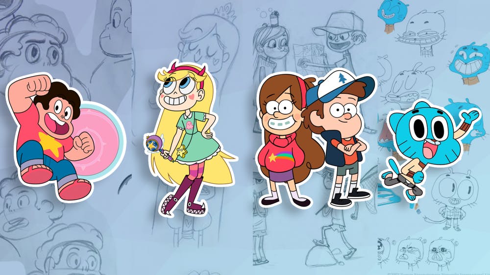
Adventure Time. Gravity Falls. Steven Universe. Star vs. The Forces of Evil. It’s not hard to argue that this past decade has seen many great cartoons with well-developed characters, beautiful music, and deep stories begin to overtake the episodic wasteland wrought by Spongebob Squarepants and others. But that is not all these shows have in common, according to some. These and other modern cartoons all suffer, supposedly, from a disease called CalArts’Style by many who critique/complain on the Internet. But what exactly do these critics mean by the term “CalArts” Style?
Also called “Thin-line animation,” the term “CalArts” style is used to, more often than not, criticize the simpler character designs of many shows over the last 8 years or so. Many fans of Western animation have griped about the “simplistic” design of these cartoons, which all seem to feature round eyes, noodle arms, “bean-shaped” heads and “worm-shaped” mouths. And, as much as I hate to give credence to anyone who complains on the internet, I must say: they do have a valid point.

Image from The Roundtable YouTube
Why do they look like that?
Before we get into the controversy of how this style affects, or doesn’t affect, the industry and creative landscape, let’s first examine the cause of this style. If many artists are using the technique to the point of viewers calling it repetitive, there must be a solid reason, right?
As stated earlier, this design style is called “thin-line animation,” which is most notable for the thin outlines that animated characters and objects have. This is in contrast to “thick-line animation,” which has bold and thick borders around animated objects. Thick-line animation was popularized during the 60s and 70s with cartoons from Hanna-Barbera and the like, then made a comeback during the late 1990s and early 2000s. These terms are used to describe basic art styles as trends come and go, as many artists during a certain period often influence others.

Image from TVTropes
The term “CalArts” is being used to degrade the current trend of thin-line animation in the industry, but it goes a bit further than that. CalArts refers to the California Institute of the Arts, which is one of the biggest and most well-known art schools in the country. CalArts alumni have influenced a wide variety of animated works, such as the Disney Renaissance, Pixar Studios (artists even hide the A-113 Easter egg throughout movies to reference the classroom where graphic design and character animation is held at CalArts.), and even television cartoons such as Gravity Falls and Star vs. The Forces of Evil. So, whenever someone uses “CalArts style” in a derogatory way, they are deriding all the artists who work on these shows as well as anyone who is attending or has attended the art school.
Currently, the trend of “thin-line animation” has less to do with everyone learning the style at CalArts (many of the creators of these shows didn’t even attend the school) and more to do with tension between new digital animation and the hand-drawn animation styles of the past. Thin-line animation makes the animation process easier and faster to do in Flash and other computer programs, which is why it is more popular now than in the 1990s and early 2000s, when most animation was still traditionally hand-drawn in some aspect. In addition to this, many artists influence other artists, which is why trends exist in general. Many of these artists have worked on two or three different shows this decade. For instance, Rebecca Sugar worked on Adventure Time as a storyboard artist before breaking away to create Steven Universe. Similarly, both Matt Burnett and Ben Levin worked on Steven Universe before co-creating Craig of the Creek, which premiered this past winter. All three shows have a similar art style, which some may call repetitive and lazy, but that art style is mostly due to these creators working closely together on the same projects.
Is this lazy and simplistic?
One of the main criticisms of the CalArts style is that it shows laziness from cartoon creators. In addition, many complain that the style is too simplistic and brings less diversity to design and animation. And while it is certainly possible to see it that way, I personally find this a weak and pointless argument. To start out, many of these shows don’t have the exact same style, and many of the characters still have their own unique design.
While many of these shows have a somewhat similar design as far as general face shape and smile, there are many other factors that determine a show’s art style. Steven Universe is known for its unique background art. The Amazing World of Gumball features a mix of 2D and 3D animation for various characters. Star vs. The Forces of Evil has very fluid and rubbery motion, featured in many comical action scenes. To say that all these shows are “lazy” or “derivative” is an argument that itself seems lazy and derivative.

Image from Tumblr
The CalArts style hasn’t always been used to deride thin-line animation. The original criticism came from John K, creator of Ren & Stimpy, throughout the 1990s, directed primarily at Disney animation. He claimed that the CalArts style was basically a rehash of design styles from Disney’s original ‘Nine Old Men’ that was ingrained into the teachings at the art school. CalArts has a close-knit relationshipwith the animation industry, as many animators in large studios have graduated from the school, and the institute was essentially co-founded by Walt and Roy Disney in the early 1960s. The main transformation of the criticism came from a 2010 blog post by John K who used the term, which then spread virally across the Internet.
Is This A Problem?
Regardless, there does seem to be a trend of shows focusing on thin-line animation. Between the reboot of Thundercats to various cereal mascot redesigns, the simplistic style is certainly pervasive in the industry right now. However, this isn’t necessarily an issue.
Western animation, as stated earlier, has seen many trends that change every decade or so. Shows in the early 2000s had either very geometric styles (such as works by Butch Hartman, Samurai Jack, Total Drama Island, etc.) or styles very similar to Eastern anime (original Teen Titans, Avatar: The Last Airbender, Gargoyles, etc.). During the 1990s, loose curves and rubbery movement was a popular callback to original Disney and Warner Bros. cartoons (Animaniacs, Ed, Edd, n Eddy, Hey Arnold!, the Disney Afternoon programming block, etc.). Its difficult to say that all shows during these animation eras were “formulaic” or “lazy,” even if some certainly were. And while the variety and amount of cartoon shows was greater then than now, there were certainly similar art styles among multiple creators in multiple studios just as there are now.

Image from Gizmodo
To say that art style is the only factor in a show’s quality or success is also completely false. Character development, plot, story arcs, dialogue, humor, and message are all important qualities to consider for cartoons just as they are for any other storytelling media. Gravity Falls will be known more for its mystery and lore than for its character design, just as Avatar: The Last Airbender will be known more for its character arcs and overarching action plot than for its “Animesque” style.
Overall, the CalArts style insult is inaccurate, lazy, and misses the bigger picture of the world of Western animation. Many shows may look similar, but that doesn’t mean they are simplistic or lacking in any other important story elements. But if the style is really an issue, there are plenty of other shows currently airing or coming soon that feature other art styles. DuckTales (2017) uses a more angular, comic-book art style as a callback to the original Carl Barks comics. Infinity Train is a new show coming to Cartoon Network in 2019 that has its own unique style. Milo Murphy’s Lawshows the same style as Phineas and Ferb (both shows were created by Jeff Marsh and Dan Povenmire) but has a more plot-driven story compared to an episodic series. The Loud Houseshowcases more zany and “cartoonish” art style that would have fit in with the 1990s and early 2000s styles. Whichever shows you choose to watch, be sure that you are enjoying them with good intentions.
Sources: TVTropes, Huffington Post, Steven Universe Wiki, Polygon, YouTube, iSpot
Images: Byte Staff, The Roundtable YouTube, TVTropes, Tumblr, Gizmodo
For more entertainment, tech, and pop culture related content, visit us at Byte BSU!