Ball State, adjusting its brand to be more modern and consistent, asked for input from members of the university through a series of three branding sessions.
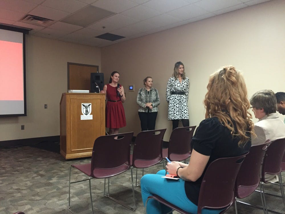
The Division of Strategic Communications held its third and final brand refresh listening session Sept. 24. The discussion revolved around the new proposed brand elements for Ball State, which include color and font changes as well the elimination of the tagline “Education Redefined.”
Julie Hopwood, interim vice president for strategic communications, said her division heard complaints about the university’s previous brand being too sterile. She said she wanted the new brand to attract people to the university.
“We want to provide that brand refresh, that structure for you, as soon as possible,” Hopwood said. “We want individuals to see our publications and say, ‘That’s where I want to be.’”
The three meetings, which were held over the course of two weeks, focused mainly on color and font changes, but Hopwood said conversation on the brand will continue. The university website will be undergoing changes for the next three years.
“We’ll be going through this together for the next several years,” Hopwood said.
Joan Todd, associate vice president of strategic communications and chief communications officer, said the decision to discontinue the use of “Education Redefined” was an effort to keep Ball State from being boxed in.
“The general consensus is that taglines are a little bit confining,” Todd said. “We feel that the primary things about being entrepreneurial learners, student-centered, a model 21st-century public research university and community-engaged are big enough to encompass the primary goals of the university while allowing for diversity.”
The changes to the fonts and colors are minor, with an emphasis on modernization. The brand will stick with the primary cardinal red and white colors and secondary black and gray, but these are just the basics, said Mary Barr, Ball State’s chief creative officer.
“Many brands kind of tweak with their color from time to time, adjusting to the marketplace and the medium,” Barr said. “Brand is our image out in the marketplace, and it’s important to protect it and make sure we’ve got a great brand out there.”
Hopwood said the new templates will be available for the university community to work with the new brand guidelines. Students and faculty can use the logo and free photos to create different media for their academic needs, while still maintaining their creativity.
Todd said the brand redesign is for all members of campus. Several telecommunications students are currently creating commercials for Ball State, which will air throughout the Midwest in January.
“We’ve been working really hard on this,” Todd said. “There is a universal need for more collaboration with us and our desire to partner with everyone on campus and serve everyone as much as we can.”
Read More

Ball State celebrates 2025 summer graduates at commencement ceremony
By Trinity Rea / 17 hours agoBall State's summer commencement honored graduates with speakers delivering messages of creativity, courage, and the power of vulnerability.

ICC: Defense letter confirms Indiana’s Camp Atterbury to be used for immigrant detention
By Indiana Capital Chronicle / 23 hours agoIndiana’s Camp Atterbury will be used to detain immigrant detainees under a new federal plan revealed this week by Defense Secretary Pete Hegseth.

ICC: ‘Good trouble’: Hoosiers rally against Trump, honor late US Rep. John Lewis
By Indiana Capital Chronicle / YesterdayHundreds of people rallied outside the Indiana Statehouse on Thursday to protest President Donald Trump and pay tribute to U.S. Rep. John Lewis of Georgia.