Grayson Joslin is a second-year journalism major and writes for The Daily News. His views do not necessarily reflect those of the newspaper.
An interest I have been fascinated with for as long as I can remember has been the design and symbolism behind a sports team's identity.
It doesn’t matter how amazing the jersey is, like the Pacers’ Flo-Jo jerseys from the 90s (my personal favorite uniforms of all time) or how putrid it is (see the Utah Jazz’s highlighter uniforms introduced earlier this year), the creation of an identity amazes me.
Getting to see the implementation of various items of cultural significance into a team’s identity is special, too. The Cleveland Guardians, taking their new name and identity from the Guardians of Traffic statues in the city, is a brilliant modern example of how an area’s identity can enhance the branding of sports teams in the area.
This naturally applies to Ball State University and its athletic teams.
Originally named the Hoosieroons, the then-named Indiana State Normal School, Eastern Division changed its athletic identity to the Cardinals in 1927. Since then, the identity of Ball State’s athletic teams have evolved, culminating with the current athletic logo used since 1989, per a previous Daily News article.
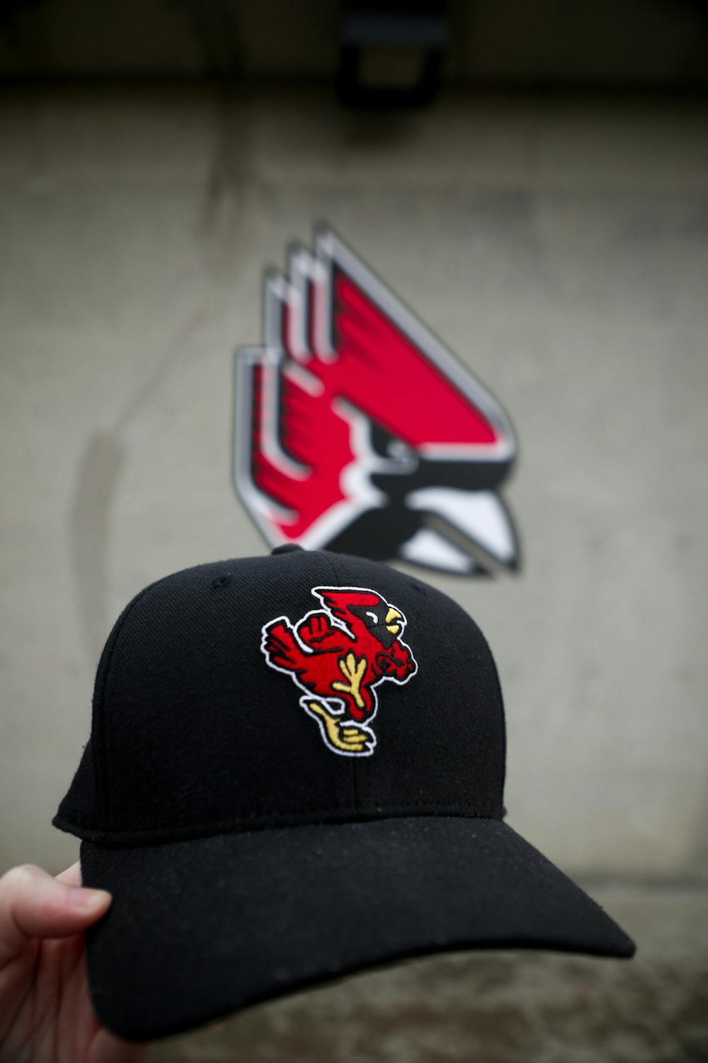
The logo replaced a logo that had been used for over 30 years, per Chris Creamer’s Sports Logo Website. This logo, affectionately called “Dancing Charlie,” was the symbol of Ball State athletics as the Cardinals became a Division I school in football and a mid-major powerhouse in men’s basketball.
Even though the logo was sleek for 1989 standards, as time has gone on, the “Triangle Cardinal” logo (as I like to call it) has stood out like a sore thumb in a changing landscape of new and creative visual identities for college athletics. Colleges like Oregon have been pushing the envelope for college uniforms, while Ball State has just been happy to be there, not innovating and instead sticking to the status quo.
Something changed in 2020. Before the pandemic-delayed football season kicked off, Ball State announced the Tradition line, complete with the return of Dancing Charlie, the university’s previous athletic logo. However, there was more.
As the football team took the turf that year, Dancing Charlie adorned the helmet, remaining there for the majority of the team’s games the past three seasons. Seeing the reemergence of the old-school Dancing Charlie got me excited.
There has been a wave of retro rebranding for college athletic teams in previous years; Tulane has been a wonderful example of a school looking back for an identity to build toward the future. The reimagining of the 1960s “Angry Wave” logo, introduced in 2016, brought new life to the Tulane athletic identity. Mid-American Conference rival Kent State brought back their 1970s helmet for a one-off in 2021.
However, just appearing on the helmets isn’t enough.
Ball State’s athletic identity is dated, and reintroducing the classic Dancing Charlie logo full-time will rejuvenate the visual identity of our Cardinals.
The Dancing Charlie logo is very pleasant to look at; there is this timeliness quality to it that makes it stand out. The old-school aesthetic of the logo makes it very charming to look at.
The same can’t be said for the current Triangle Cardinal logo; it just has the aesthetic of a logo that came out of the 1980s, and unlike the good logos from the 1980s, this one has not aged well. Before the logo was slightly updated in 2015, it had cheesy motion lines above the cardinal’s head.
When announcing these subtle changes, then-athletic director Mark Sandy said, “That refreshed brand can say things are on the move, and we’re up-to-date and on the cutting edge of what people are looking for.”
I’m sorry, but even in 2015, the Triangle Cardinal was not up-to-date.
Earlier this year, Mid-American Conference rival Akron introduced its new logo set, which emphasized simplicity and modernness. Even though it was just introduced, it looks like a logo that was plucked straight from the 1950s, and it looks great.
Ever since its resurrection, Dancing Charlie has come to represent success. In 2020, the first season of the logo on the football team’s helmets, the Cardinals won their first conference championship in 1996 and their first bowl game in school history en route to a 23rd-place ranking in the season-ending AP Poll.
The next season saw Ball State qualify for back-to-back Bowl games for only the third time in school history. Even if correlation does not equal causation, Dancing Charlie has been there during some of the most successful times for our athletic programs.

But a question is then pondered: why should we care so much about Ball State’s image and identity? An attractive athletic brand can elevate it and place it in the good graces of people. When explaining Vanderbilt’s athletic rebranding in 2022, athletic director Candice Lee said, “We have got to own [Vanderbilt’s] brand … the symbols do matter.”
Her reasoning is logical and sound; branding can contribute so much and could be the charm a group, company or sports team needs. The Dancing Charlie logo has the charm the Triangle Cardinal logo wishes it could have. It is from a bygone era, yet timeless, and it represents determination, while the Triangle Cardinal logo lacks any emotion.
Ball State has been exceptional and innovative in its education, and the university needs to transfer the charm and prestige of our education into our athletic branding; that is what makes the Dancing Charlie logo fit well with the message Ball State hopes to communicate about the university-at-large.
One of my favorite qualities of the logo is how you can tell Charlie is moving forward, and that is right on cue with how Ball State wants to be branded. Some words used in Ball State’s Brand Style Guide to communicate the “language” of the Ball State story include confident, empowered and forward-thinking. The Dancing Charlie logo communicates the image of Ball State better than the Triangle Cardinal logo ever could.
And that leads me to one of the main reasons that makes the Dancing Charlie logo so brilliant: it’s different and unique. The cardinal is one of the most popular mascots, with the red bird being the 11th most popular team nickname in the United States. With most of these logos, it’s the same old song and dance, just a drawing of the head of the cardinal. College teams such as Illinois State, Louisville, Lamar and even the Arizona Cardinals of the NFL are guilty of this trend.
Dancing Charlie forgoes this trend by showing the whole body, making this logo stand out by not being just his face. Ball State needs to lend uniqueness to our nickname when it is so popular, especially since the cardinal is the state bird of Indiana.
Changing our full-time athletic logo to Dancing Charlie can be the tip of the iceberg when it comes to forging our own unique athletic identity. We can add even more sprinkles of our distinctive Ball State identity; the messaging and values of Beneficence, our motto “We Fly”, and even the shirt design Richard Dreyfuss wore in “Close Encounters of the Third Kind” can add depth to our athletic branding.
The retro wave of rebranding has been in full effect recently. Teams like the Cleveland Browns and the Golden State Warriors have turned back the clocks for special retro looks, while the Arizona Coyotes and the Milwaukee Brewers have brought back past logos full-time. This wave gives teams the chance to look back at their past while creating a new identity for the future, an approach Ball State Athletics needs to take.
David Letterman has often called Ball State’s athletic teams the “fighting Cardinals.” The Dancing Charlie logo represents the tenacious spirit of our athletic teams, and it deserves a second life as our primary athletic logo.
Contact Grayson Joslin with comments at Grayson.joslin@bsu.edu or on Twitter @GraysonMJoslin.
Read More
Road closure between Warwick and Briar road
By Staff Reports / 8 hours agoThere is a road closure on Riverside Avenue between Warwick and Briar roads directly in front of the Cooper Science Building due to a geothermal leak.

Tagayi to Represent France at U19 Tournament Before Joining Ball State
By Staff Reports / YesterdayBefore making her debut in the Mid-American Conference, incoming Ball State women's basketball player Aniss Tagayi will compete for her home country as part of the French national team in the U19 competition.

IPR: Ball State Village hotel project granted tax abatement for 10 years
By Indiana Public Radio / YesterdayThe new hotel being built next to Ball State University in the Village has been given a tax abatement for the next decade. But as IPR’s Stephanie Wiechmann reports, an agreement with the developer means Muncie coffers will see some money from the project in that time.